
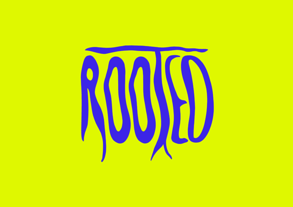
ROOTED is a skincare brand inspired by the untamed beauty of nature.
The project explores an alternative approach to natural cosmetics branding — moving away from the soft, minimalist aesthetics commonly associated with the category and replacing them with a bold, expressive visual language.
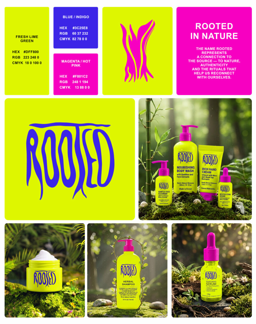
At the heart of the identity is the idea that nature is not delicate or passive. It is vibrant, resilient and constantly growing. The visual system reflects this energy through organic forms, high-contrast colors and a distinctive logotype inspired by roots, plants and natural movement.
The name ROOTED represents a connection to the source — to nature, authenticity and the rituals that help us reconnect with ourselves.
Slogan “Rooted in nature“.
The identity combines:
- logotype
- naming & slogan
- expressive typography,
- organic illustration,
- vibrant color contrasts,
- packaging design,
- campaign-driven visual communication.
A striking palette of fresh lime green, electric indigo and hot magenta was chosen to challenge traditional beauty industry conventions and create a strong shelf presence. The result is a brand that feels modern, memorable and impossible to ignore.
The visual language was designed to extend naturally across:
- product packaging,
- social media campaigns,
- advertising materials,
- retail environments,
- digital experiences.
Rather than relying on clichés often found in the natural skincare market, ROOTED presents nature as something bold, alive and full of character.
The project demonstrates how strategic branding and distinctive visual storytelling can transform a product into a recognizable brand experience.
Comments are closed