
MELTED CAT is an ice cream brand built around a playful visual idea: a curious cat slowly melting under the summer sun.
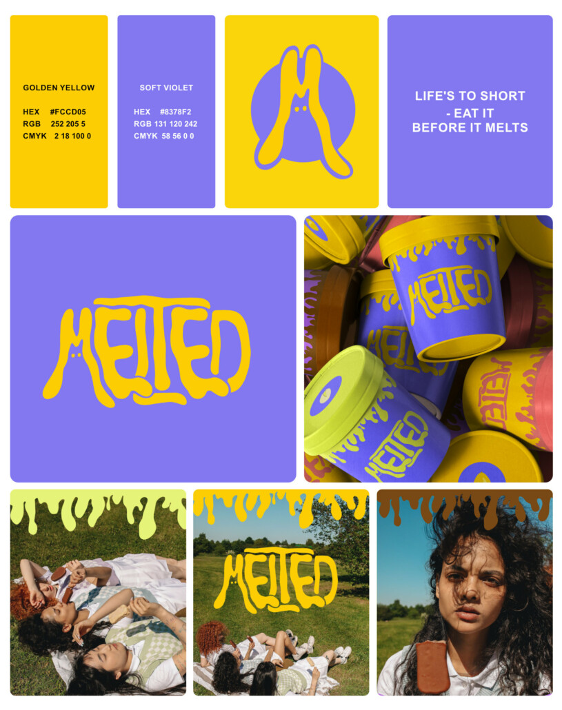
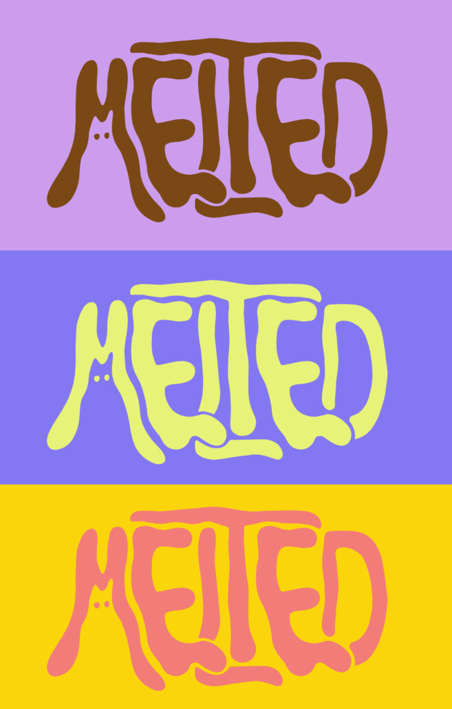
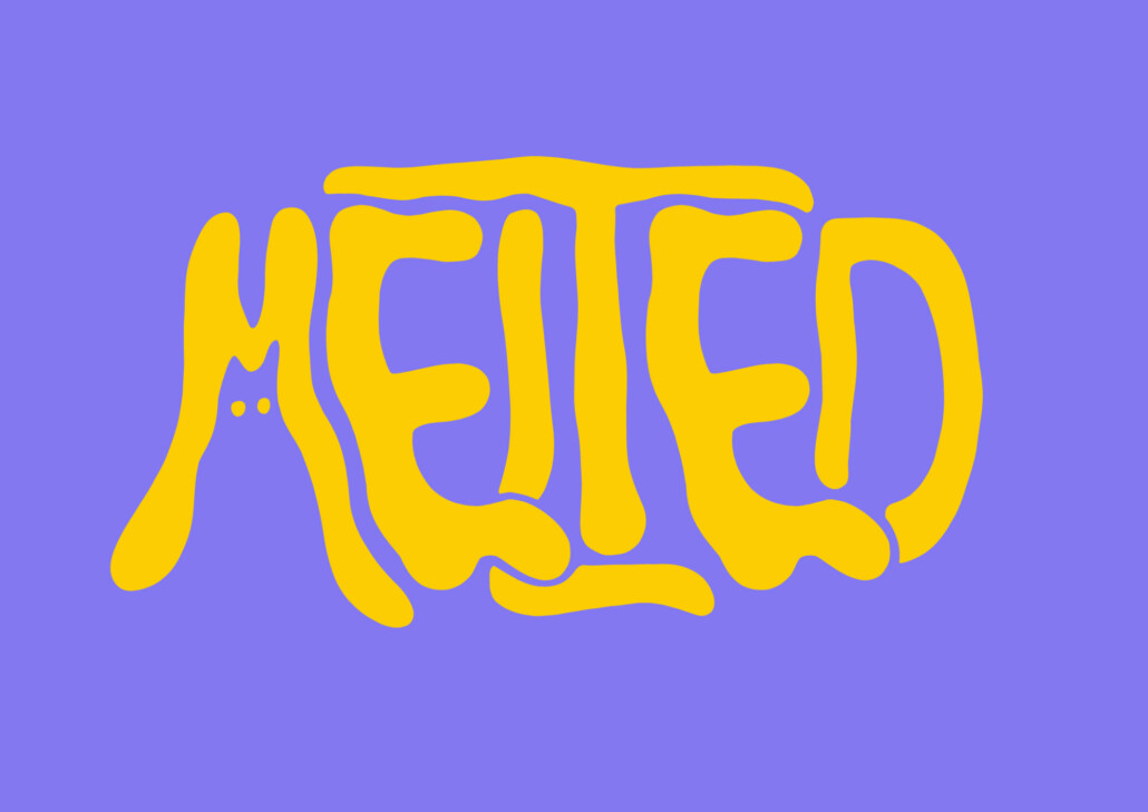
The identity combines naming, custom lettering with illustration, turning the logo itself into the brand’s main character. Soft, flowing letterforms mimic melting ice cream while subtly revealing the silhouette of a cat, creating a memorable and distinctive visual mark.
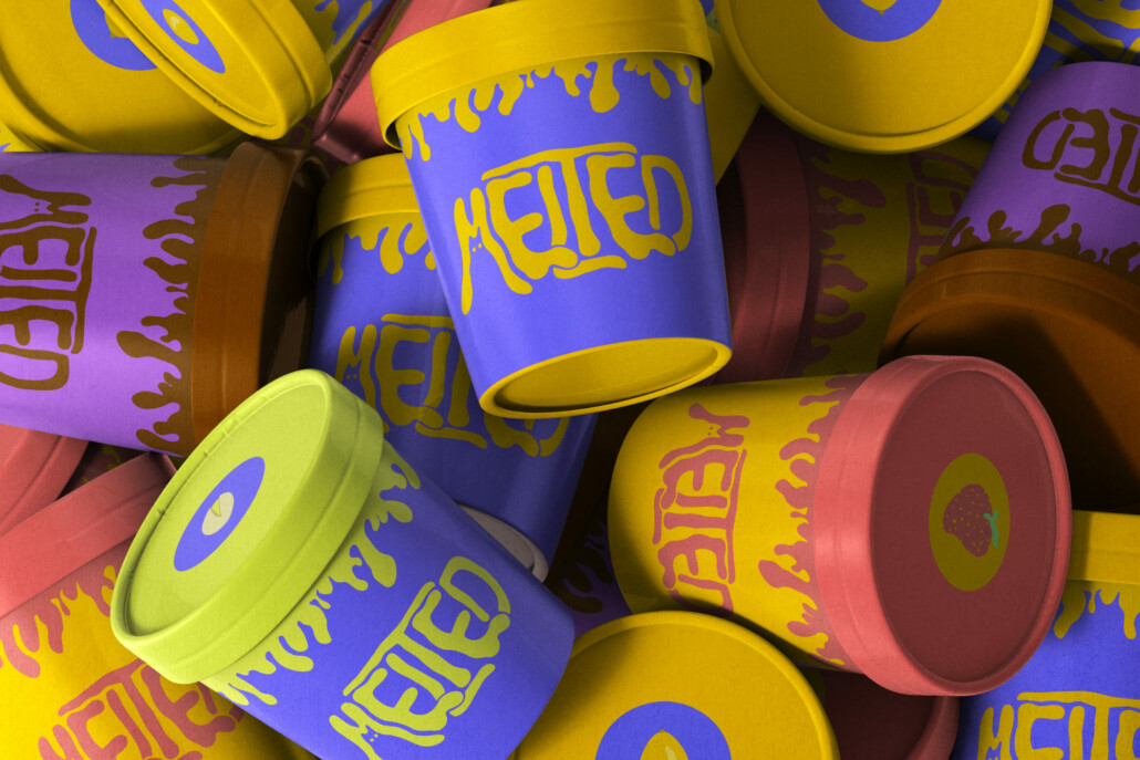
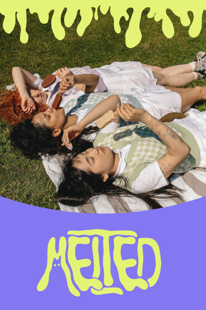
Designed to stand out in a crowded market, the brand embraces bold colors, quirky humor and expressive visuals instead of traditional nostalgic or premium ice cream aesthetics.
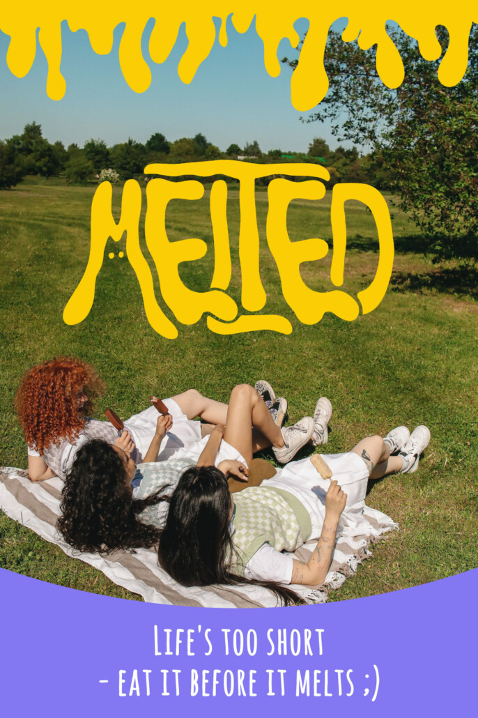
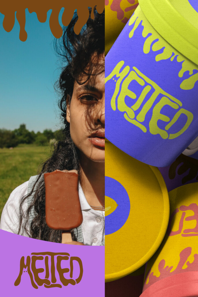
The project explores how illustration and typography can work together to create a strong brand personality across packaging, advertising, social media and seasonal campaigns.
MELTED CAT is more than an ice cream brand – it’s a playful visual world that celebrates summer, curiosity and the joy of embracing the mess before everything melts.
Looking for a brand with a story worth remembering? Let’s create it together.
Comments are closed