
Most coffee brands sell taste.
MONDAY CLUB sells survival mode.
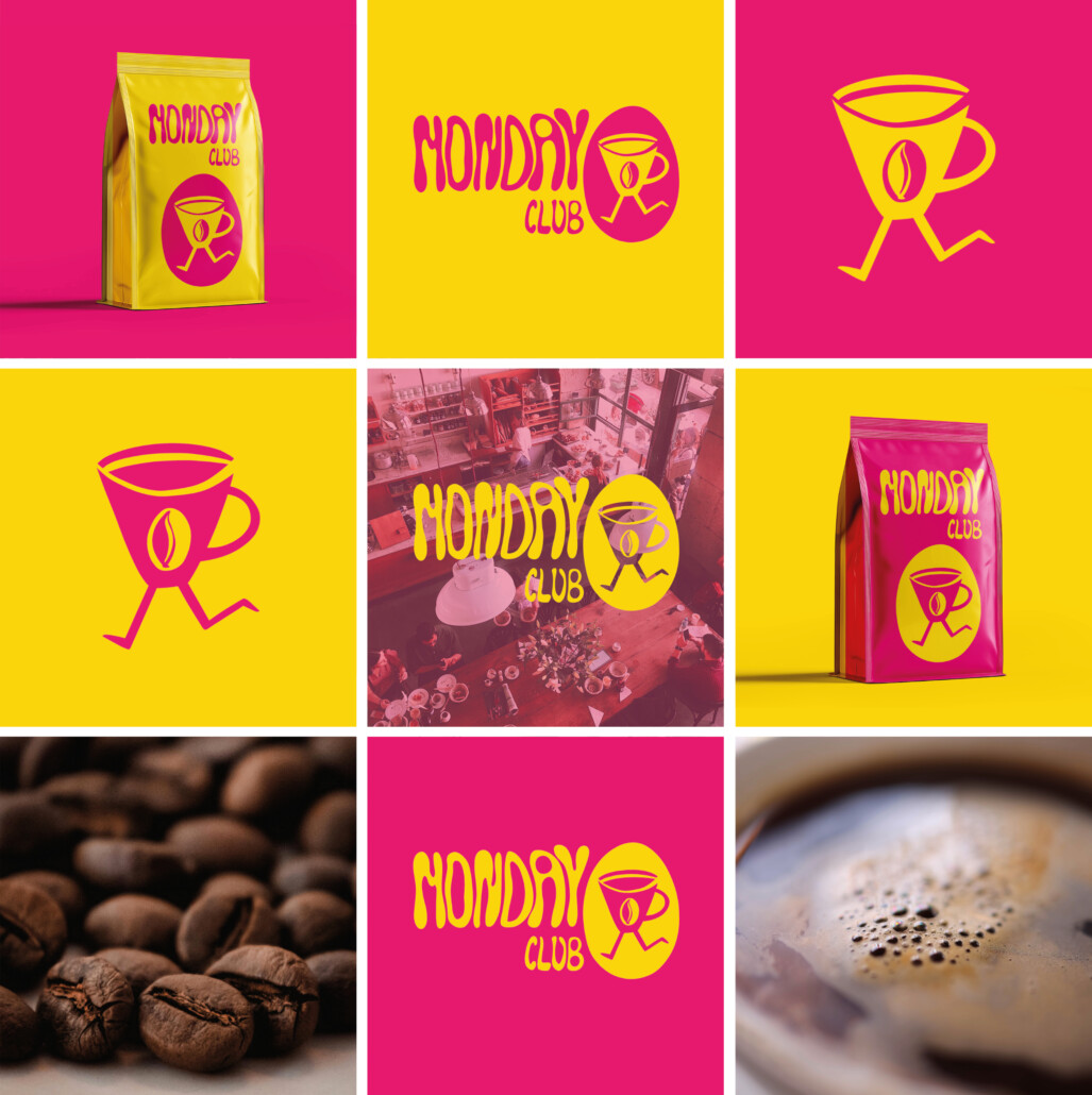
The idea behind the project was to create a coffee brand for people functioning somewhere between exhaustion, overstimulation and “just one more coffee”.
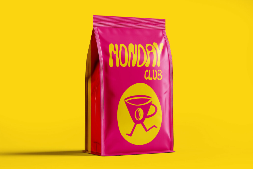
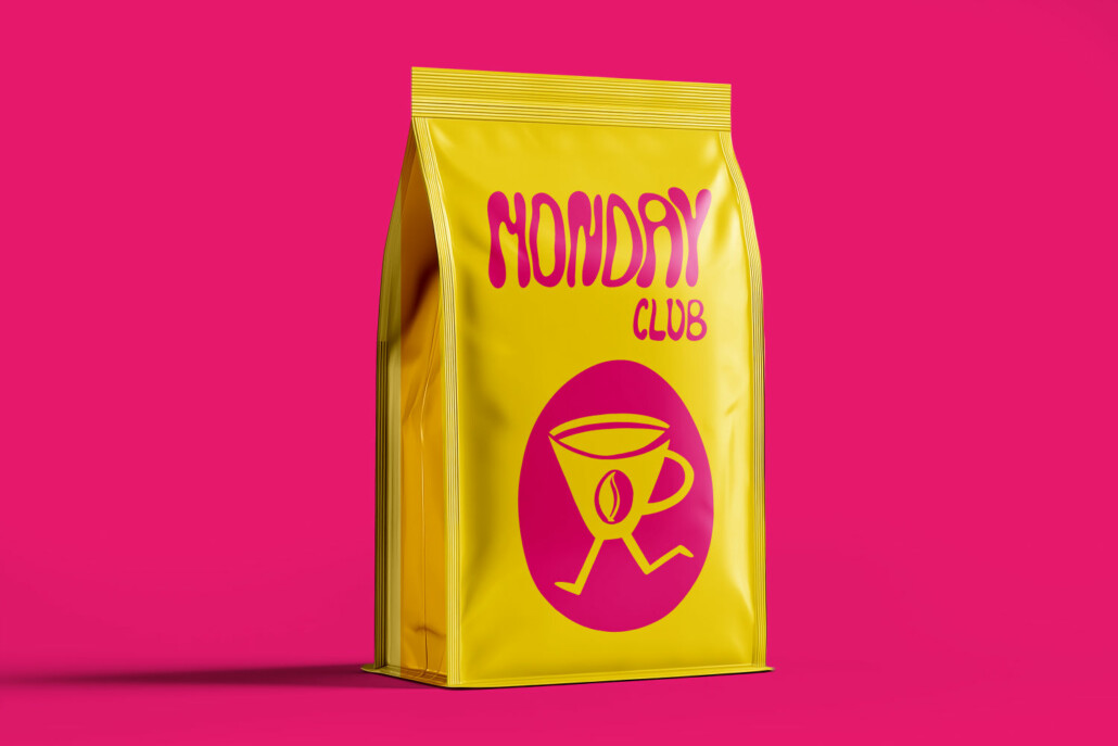
Instead of another minimal, premium-looking coffee identity, I wanted to build a brand with personality — bold, humorous and instantly recognizable.
The visual system is based on:
- expressive typography,
- high-contrast colors,
- simple mascot illustration,
- energetic campaign-style layouts.
The running coffee cup character became the symbol of constant movement, chaos and everyday caffeine dependency.
The project combines:
- branding,
- illustration,
- packaging,
- visual communication,
- campaign thinking.
MONDAY CLUB was designed as a brand that could naturally live across:
- packaging,
- social media,
- outdoor campaigns,
- merchandise,
- digital content.
The goal wasn’t just to design a logo — it was to create a recognizable visual world around a shared feeling: trying to survive Monday.

Comments are closed