
Snack Attack Snack Brand Identity
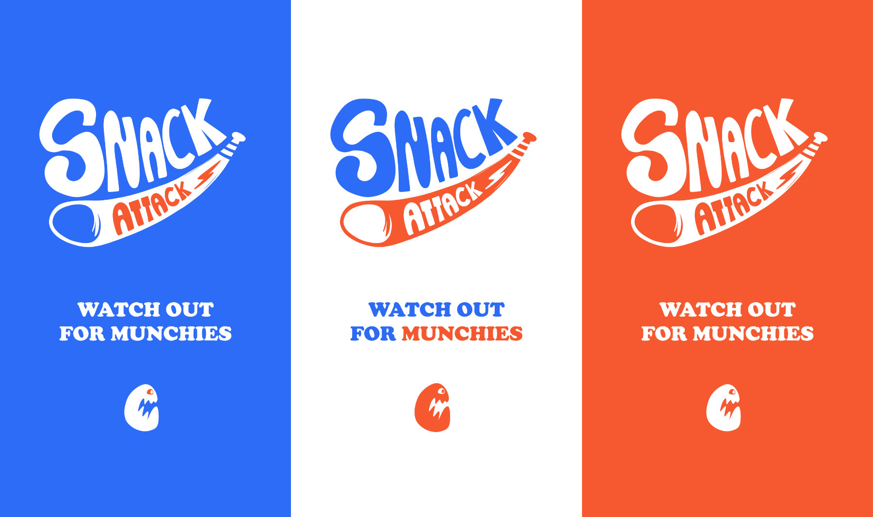
A playful snack brand identity concept designed to stand out through bold typography, strong personality and packaging-ready visual storytelling.
THE CHALLENGE
This self-initiated design challenge explored how a snack brand could create a memorable presence in a crowded category without relying on generic food branding conventions.
MY APPROACH
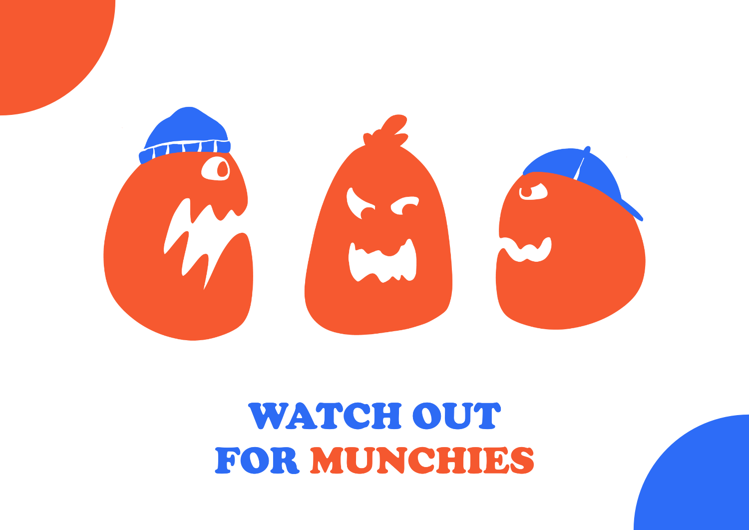
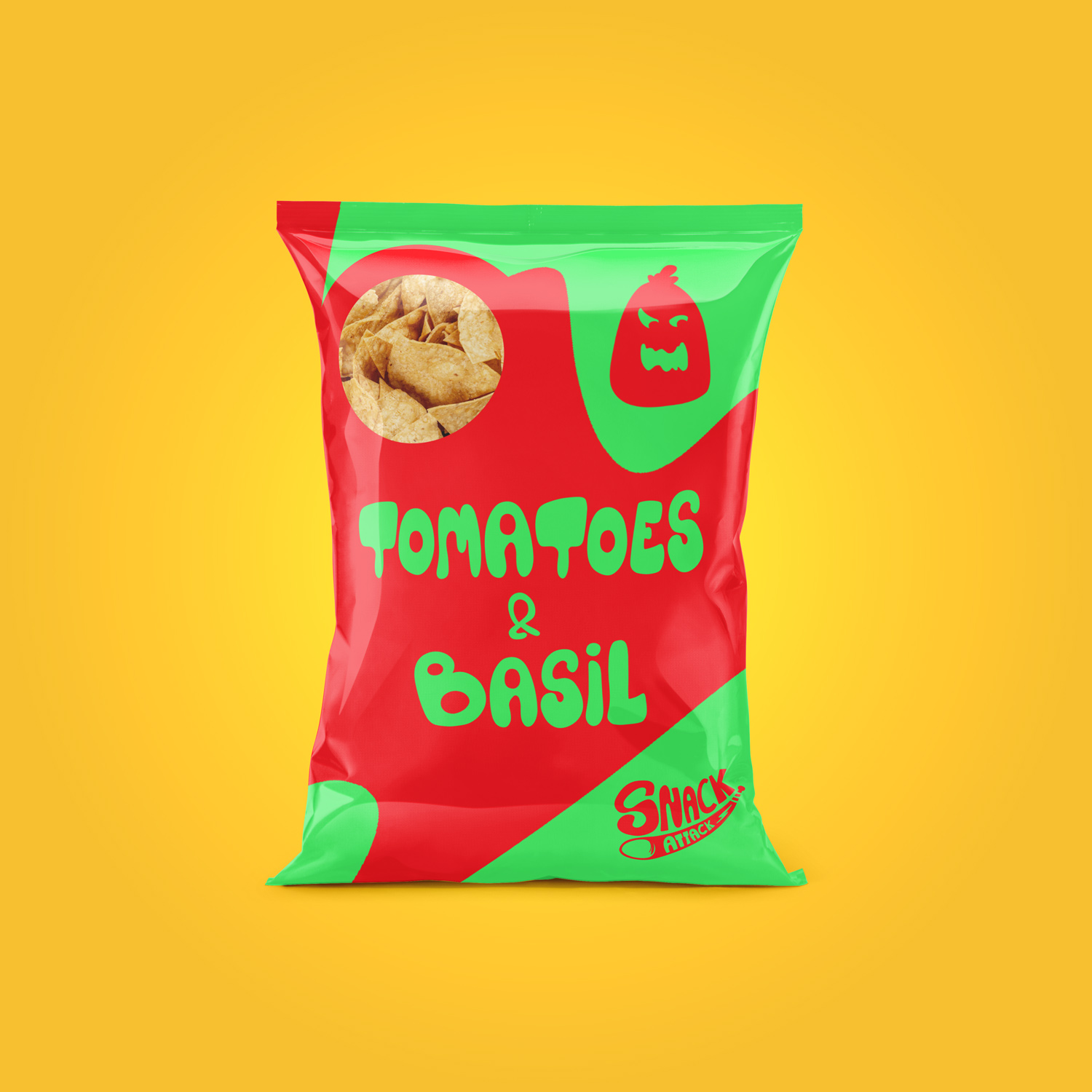
I focused on building a visual identity with energy, humour and strong shelf presence. The goal was to create a brand that feels instantly recognisable while leaving room for future character development and packaging applications.
THE SOLUTION
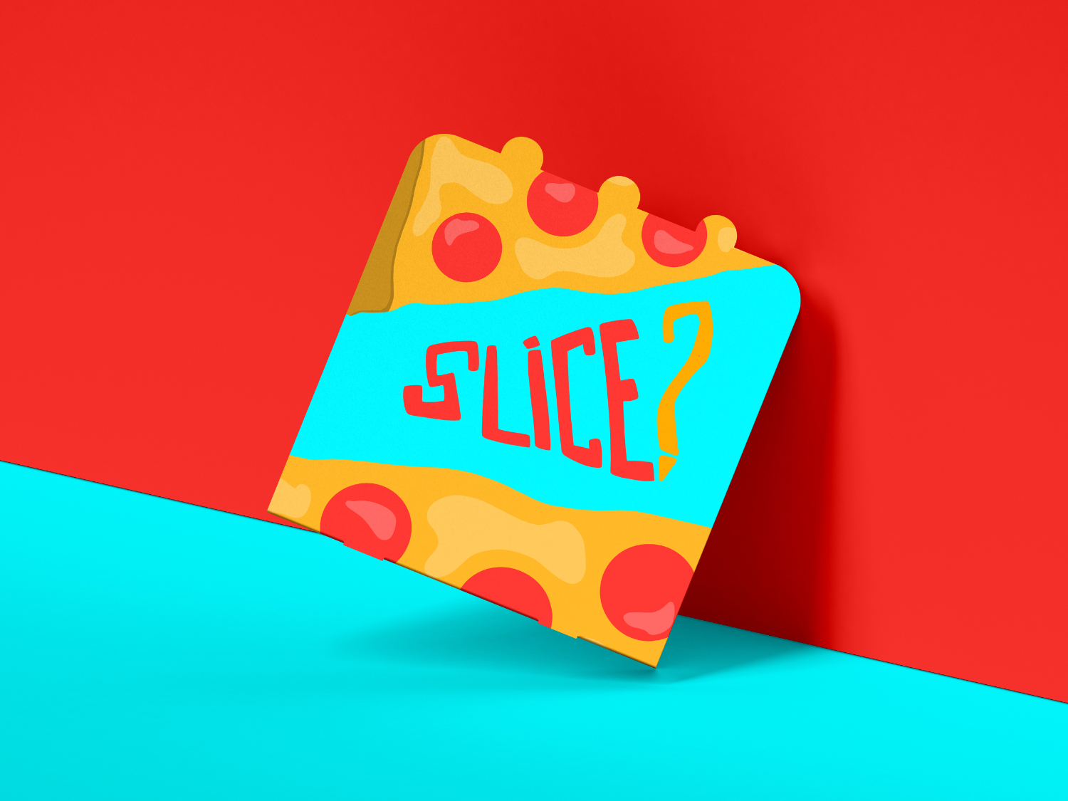
The final identity combines custom lettering, bold colour contrast and a distinctive brand mark to create a flexible visual system. The approach helps the brand communicate personality while remaining adaptable across packaging, advertising and digital touchpoints.
WHAT I CREATED
- Brand identity concept
- Custom logotype
- Brand mark
- Tagline
- Colour palette
- Visual identity assets
MY ROLE
Brand Identity Design, Illustration, Art Direction and Graphic Design.
FINAL RESULT
Snack Attack demonstrates how a typography-led concept can become a memorable consumer brand identity. The visual system provides a strong foundation for packaging, campaigns and future brand extensions.
FAQ
Is Snack Attack a real client project?
No. It was developed as a self-initiated branding concept.
What services does this project showcase?
Brand identity design, illustration, typography and art direction.
What type of products could use this branding approach?
Snacks, confectionery, packaged food products and consumer brands.
Can the identity be expanded into a complete packaging system?
Yes. The visual system is designed to scale across multiple products and formats.
What makes this identity distinctive?
Expressive typography, strong personality and high potential for character-led branding.
Comments are closed